Zoomtopia is here. Unlock the transformative power of generative AI, helping you connect, collaborate, and Work Happy with AI Companion.
Register now-
Products
Empowering you to increase productivity, improve team effectiveness, and enhance skills.
Learn moreCommunication
Productivity
Apps & Integration
Employee Engagement
Customer Care
Sales
Ecosystems
- Solutions
By audience- Resources
Connect & learnHardware & servicesDownload the Zoom app
Keep your Zoom app up to date to access the latest features.
Download Center Download the Zoom appZoom Virtual Backgrounds
Download hi-res images and animations to elevate your next Zoom meeting.
Browse Backgrounds Zoom Virtual Backgrounds- Plans & Pricing
- Solutions
-
Product Forums
Empowering you to increase productivity, improve team effectiveness, and enhance skills.
Zoom AI CompanionBusiness Services
-
User Groups
Community User Groups
User groups are unique spaces where community members can collaborate, network, and exchange knowledge on similar interests and expertise.
Location and Language
Industry
-
Help & Resources
Community Help
Help & Resources is your place to discover helpful Zoom support resources, browse Zoom Community how-to documentation, and stay updated on community announcements.
-
Events
Community Events
The Events page is your destination for upcoming webinars, platform training sessions, targeted user events, and more. Stay updated on opportunities to enhance your skills and connect with fellow Zoom users.
Community Events
- Zoom
- Products
- Zoom Meetings
- Re: Is there an option to change the menu bar icon...
- Subscribe to RSS Feed
- Mark Topic as New
- Mark Topic as Read
- Float this Topic for Current User
- Bookmark
- Subscribe
- Mute
- Printer Friendly Page
Is there an option to change the menu bar icon back?
- Mark as New
- Bookmark
- Subscribe
- Mute
- Subscribe to RSS Feed
- Permalink
- Report Inappropriate Content
2022-12-23
08:30 AM
- last edited on
2023-05-26
07:04 AM
by
![]() RN
RN
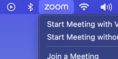
I see that the menu bar icon has changed from a narrow, video camera icon to a double-width icon of the word "zoom". On MacBooks, this is a big problem because of the "notch". Having that double-width icon pushes other icons out of view.
I love having Zoom in my menu bar, but with the size I have to remove it. Is there any way to set the icon back to the smaller one, so I can keep it?
- Topics:
-
Other
- Mark as New
- Bookmark
- Subscribe
- Mute
- Subscribe to RSS Feed
- Permalink
- Report Inappropriate Content
2022-12-23 08:39 AM
Hello @StrayTaco,
To my knowledge the icon is the same size that it has always been we just changed the logo inside of the icon. I have a mac and I cannot tell the difference. Is there an accessibility setting that you have selected that maybe I do not have selected on my machine?
Thanks,
Brandon
- Mark as New
- Bookmark
- Subscribe
- Mute
- Subscribe to RSS Feed
- Permalink
- Report Inappropriate Content
2023-01-03 02:01 PM - edited 2023-01-03 02:09 PM
I would also like to be able to switch back. The new menu bar icon is unnecessarily large and takes up way too much space. Here's some screenshots showing the icon next to some normal sized icons, not sure how you can't see the difference @YaBoiB, it's nearly twice as wide. The old icon (the camera) was roughly the same size as the wifi or bluetooth icons here, and it fit in much better.
- Mark as New
- Bookmark
- Subscribe
- Mute
- Subscribe to RSS Feed
- Permalink
- Report Inappropriate Content
2023-01-10 04:11 PM
I'd like to +1 the camera icon making a come back. The full word ZOOM takes too much room!
- Mark as New
- Bookmark
- Subscribe
- Mute
- Subscribe to RSS Feed
- Permalink
- Report Inappropriate Content
2023-01-10 08:13 PM
This is our new platform icon and I do not see this changing anytime soon, but you can send your feedback to the zoom.us/feed page and if enough customers are not happy with the new design the Product team will definitely take that into consideration.
Thanks,
Brandon
- Mark as New
- Bookmark
- Subscribe
- Mute
- Subscribe to RSS Feed
- Permalink
- Report Inappropriate Content
2023-01-12 04:32 PM - edited 2023-01-12 04:33 PM
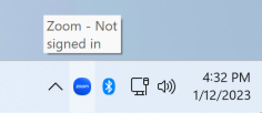
@YaBoiB I understand that this is the new platform icon, and I don't specifically want the old camera icon back, just something square so that the icon doesn't take up so much space. On Windows for example the icon in the taskbar is a square, why can't something like this be used on macOS as well?
- Mark as New
- Bookmark
- Subscribe
- Mute
- Subscribe to RSS Feed
- Permalink
- Report Inappropriate Content
2023-01-18 10:17 AM - edited 2023-01-18 10:21 AM
yeah man that's not ok. If every app did that with their logos, most of us would need a 90" display to have them all in the menu bar.
It's really bad and it shows how Zoom doesn't care about UX and their users. You can't change the menu bar icon to a smaller (standard) one! No other app I use is so inconsiderate of users' needs and arrogant in the UI.
The only choice here is to remove Zoom from the menu bar: a loss for both parts (users and folks at zoom).
- Mark as New
- Bookmark
- Subscribe
- Mute
- Subscribe to RSS Feed
- Permalink
- Report Inappropriate Content
2023-05-22 06:24 PM
@giovannim wrote:No other app I use is so inconsiderate of users' needs and arrogant in the UI.
This is it for me. I get that someone at Zoom decided this is really important for their brand... And other than this decision my feelings about the Zoom brand have been pretty positive. But this double-wide icon just makes me think that the "Zoom Brand" is telling me that the "Zoom Brand" is more important than its function.
And in the end, I've now removed Zoom from my menu bar entirely, so how is that good for the "Zoom Brand"?
- Mark as New
- Bookmark
- Subscribe
- Mute
- Subscribe to RSS Feed
- Permalink
- Report Inappropriate Content
2023-01-19 10:15 AM
Please pass this along to the appropriate Product Manager.
Not only do I loathe this change, but I will no longer keep zoom running on my machine. This is, first and foremost, a space violation at best, and incredibly rude at worst. This is like going into a crowded subway and lying prone on the accessibility sections and making the other apps push into the menubar.
If I were Sr. Product Mgr for Zoom, I'd think twice before doing this, because it's one step away from violating the trust of your users.
- Mark as New
- Bookmark
- Subscribe
- Mute
- Subscribe to RSS Feed
- Permalink
- Report Inappropriate Content
2023-02-26 02:45 PM - edited 2023-02-26 02:45 PM
- Mark as New
- Bookmark
- Subscribe
- Mute
- Subscribe to RSS Feed
- Permalink
- Report Inappropriate Content
2023-01-26 08:53 AM
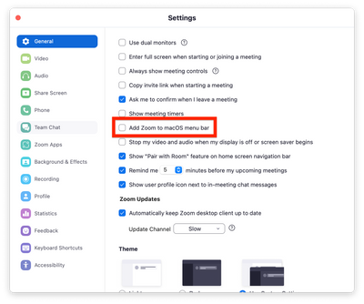
This new icon is eating all the space from navigation bar. Luckily you can disable it in settings or switch to Meet / Teams.
- Mark as New
- Bookmark
- Subscribe
- Mute
- Subscribe to RSS Feed
- Permalink
- Report Inappropriate Content
2023-01-27 09:22 AM
Hello All,
As I stated above, please express your concerns to our team through the correct process on our Feedback page. This page is monitored by the Product team, which makes these decisions.
Thank you,
Brandon
- Mark as New
- Bookmark
- Subscribe
- Mute
- Subscribe to RSS Feed
- Permalink
- Report Inappropriate Content
2023-03-06 05:46 AM
Can you do that and share back the link?
- Mark as New
- Bookmark
- Subscribe
- Mute
- Subscribe to RSS Feed
- Permalink
- Report Inappropriate Content
2023-03-06 05:48 AM
I have been booking my meetings on Teams just because of this. That tray icon looks like an advertisement banner. I cannot go to my clients with that on my screen.
- Mark as New
- Bookmark
- Subscribe
- Mute
- Subscribe to RSS Feed
- Permalink
- Report Inappropriate Content
2023-03-10 05:02 AM
Please change this back to a single-wide icon.
Personally I've disabled the menu bar item completely now.
- Mark as New
- Bookmark
- Subscribe
- Mute
- Subscribe to RSS Feed
- Permalink
- Report Inappropriate Content
2024-02-07 07:00 PM
This resolves my problem entirely. Thank you!
- Mark as New
- Bookmark
- Subscribe
- Mute
- Subscribe to RSS Feed
- Permalink
- Report Inappropriate Content
2023-04-18 10:31 AM
In command-line shell:
cd /Applications/zoom.us.app/Contents/Frameworks/zMacResRetina.bundle/Contents/Resources
sudo chmod 777 .
sudo chmod 666 menu_tray*
Use Preview to crop menu_tray.png and *********** to just the letter Z.
In same shell as above:
sudo chmod 755 .
sudo chmod 644 menu_tray*
Restart Zoom
- Mark as New
- Bookmark
- Subscribe
- Mute
- Subscribe to RSS Feed
- Permalink
- Report Inappropriate Content
2023-05-24 09:09 AM - edited 2023-05-24 09:11 AM
This is excellent, I had some finickyness with resizing, note that the 2x.png has to be exactly twice the size of the menu_tray.png file, so in my case, it was 9px by 8px, and therefore 18px by 16px in the 2x file. It got grumpy when they weren't perfectly matched, but I love this hack! I recommend keeping a copy of your cropped images, so that if Zoom updates, and puts the big one back, you can quickly copy them back in again, like:
# Assuming the cropped images are in ~/Desktop/zoomicons/
sudo cp ~/Desktop/zoomicons/menu_tray* /Applications/zoom.us.app/Contents/Frameworks/zMacResRetina.bundle/Contents/Resources/
Here is what it looks like now!
- Mark as New
- Bookmark
- Subscribe
- Mute
- Subscribe to RSS Feed
- Permalink
- Report Inappropriate Content
2023-04-18 10:34 AM
The second filename was incorrectly interpreted as an email address. Here's a second attempt:
Use Preview to crop menu_tray.png and menu_tray @2x.png to just the letter Z
- Mark as New
- Bookmark
- Subscribe
- Mute
- Subscribe to RSS Feed
- Permalink
- Report Inappropriate Content
2024-01-12 04:38 AM
This hack doesn't seem to be working for me. Has anyone else had any luck?
- Mark as New
- Bookmark
- Subscribe
- Mute
- Subscribe to RSS Feed
- Permalink
- Report Inappropriate Content
2024-01-12 05:39 AM - edited 2024-01-12 05:42 AM
It is still working for me in 5.17.2. As mitchell-l-avp said, there may be sensitivity to file sizes. Here are some details around my replacement images. The "*" is really an "at" symbol that seems to be misinterpreted by the site software.
$ file menu_tray*
menu_tray.png:    PNG image data, 8 x 9, 8-bit/color RGBA, non-interlaced
menu_tray*2x.png: PNG image data, 16 x 18, 8-bit/color RGBA, non-interlaced
- FEATURE SUGGESTION: Recording option flexibility in Zoom Meetings
- call queue setup: ring 2 simultaneously, if no answer ring a 3rd...? in Zoom Phone System
- Zoom on Linux with Remote Support/Screen Share: Critical Issues in Zoom Meetings
- New update doesn't show the virtual background, blur background or touch up appearance options in Zoom Meetings
- Security Settings assistance in Zoom Meetings


