Zoomtopia is here. Unlock the transformative power of generative AI, helping you connect, collaborate, and Work Happy with AI Companion.
Register now-
Products
Empowering you to increase productivity, improve team effectiveness, and enhance skills.
Learn moreCommunication
Productivity
Apps & Integration
Employee Engagement
Customer Care
Sales
Ecosystems
- Solutions
By audience- Resources
Connect & learnHardware & servicesDownload the Zoom app
Keep your Zoom app up to date to access the latest features.
Download Center Download the Zoom appZoom Virtual Backgrounds
Download hi-res images and animations to elevate your next Zoom meeting.
Browse Backgrounds Zoom Virtual Backgrounds- Plans & Pricing
- Solutions
-
Product Forums
Empowering you to increase productivity, improve team effectiveness, and enhance skills.
Zoom AI CompanionBusiness Services
-
User Groups
Community User Groups
User groups are unique spaces where community members can collaborate, network, and exchange knowledge on similar interests and expertise.
Location and Language
Industry
-
Help & Resources
Community Help
Help & Resources is your place to discover helpful Zoom support resources, browse Zoom Community how-to documentation, and stay updated on community announcements.
-
Events
Community Events
The Events page is your destination for upcoming webinars, platform training sessions, targeted user events, and more. Stay updated on opportunities to enhance your skills and connect with fellow Zoom users.
Community Events
- Zoom
- Products
- Zoom Meetings
- Re: Confusing Desktop Interface
- Subscribe to RSS Feed
- Mark Topic as New
- Mark Topic as Read
- Float this Topic for Current User
- Bookmark
- Subscribe
- Mute
- Printer Friendly Page
Effective January 9th, 2026 through January 22nd, 2026: The Zoom Community is currently in read-only mode with login disabled, to deliver you a new and improved community experience!
The site is still accessible to view, however, the ability to login, create content, or access your community account is temporarily unavailable. We appreciate your patience during this time. If seeking support, please browse existing community content or ask our Zoom Virtual Agent.
Confusing Desktop Interface
- Mark as New
- Bookmark
- Subscribe
- Mute
- Subscribe to RSS Feed
- Permalink
- Report Inappropriate Content
2023-08-22 02:17 PM
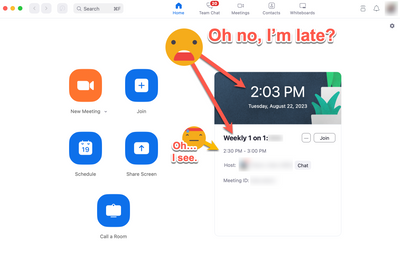
I can't tell you how many times I've been confused about the start time of upcoming Zoom meetings.
Problem:
My eye naturally goes from (1) current time to (2) bolded event name.
It gets me every time.
Product team, please help a girl out. 🙏 Change the UI so the visual information hierarchy is scannable and clear.
- Topics:
-
Meeting Features
- Mark as New
- Bookmark
- Subscribe
- Mute
- Subscribe to RSS Feed
- Permalink
- Report Inappropriate Content
2023-09-20 02:19 PM
I hate the zoom interface. Its the worst one yet. Goto Meeting and Microsoft Teams rock. When you switch to sharing your screen you don't lose the Teams window or the Goto Interface. When you share a screen in Zoom, it shrinks the Zoom window to just a video of you, loses the prior interface, and then throws the bleeping "sharing tools" in a random location, usually top of the window. I can't tell you how distracting it is to someone hosting a meeting to suddenly have their controls "disappear". Why the heck would I only want to see a video feed of myself? Why wouldn't I be interested in seeing the other users that are talking. I can't tell you how fast I would can ZOOM and use Teams simply because of the lost video feeds of others when you share a screen. So blasted frustrating. It happens every meeting and I still can't get used to the Zoom interface going from somewhat useful to "nothing" gone. Then hunting through my other windows to find the tiny video feed of myself, try to switch it back to the full size, and nothing. Garbage. Attached is a photo of what I see when I give up the meeting share screen, but I kind of feel like I should be seeing the video feeds and controls all the time - don't you?
By the way, telling me what words I can use to describe garbage is also frustrating. I'm toning this down and still finding your interface not 1/4 as good as Teams.
- Sniffing Post Quantum TLS from Android device in Zoom Meetings
- Difficulty Sharing Clipboard in Zoom | Windows | All Versions in Zoom Meetings
- French Keyboard Shortcut Discrepancy: Alt+Q (Web) vs. Alt+A (Desktop) in Zoom Meetings
- Help with Configuring SetSuppressBackgroundNoiseLevel via Registry Keys on Windows Zoom Desktop clie in Zoom Meetings
- Add Zoho Calendar Support to Calendar Integration Features in Zoom Meetings

