Zoomtopia is here. Unlock the transformative power of generative AI, helping you connect, collaborate, and Work Happy with AI Companion.
Register now-
Products
Empowering you to increase productivity, improve team effectiveness, and enhance skills.
Learn moreCommunication
Productivity
Apps & Integration
Employee Engagement
Customer Care
Sales
Ecosystems
- Solutions
By audience- Resources
Connect & learnHardware & servicesDownload the Zoom app
Keep your Zoom app up to date to access the latest features.
Download Center Download the Zoom appZoom Virtual Backgrounds
Download hi-res images and animations to elevate your next Zoom meeting.
Browse Backgrounds Zoom Virtual Backgrounds- Plans & Pricing
- Solutions
-
Product Forums
Empowering you to increase productivity, improve team effectiveness, and enhance skills.
Zoom AI CompanionBusiness Services
-
User Groups
Community User Groups
User groups are unique spaces where community members can collaborate, network, and exchange knowledge on similar interests and expertise.
Location and Language
Industry
-
Help & Resources
Community Help
Help & Resources is your place to discover helpful Zoom support resources, browse Zoom Community how-to documentation, and stay updated on community announcements.
-
Events
Community Events
The Events page is your destination for upcoming webinars, platform training sessions, targeted user events, and more. Stay updated on opportunities to enhance your skills and connect with fellow Zoom users.
Community Events
- Zoom
- Products
- Zoom Meetings
- The Zoom website is dumb
- Subscribe to RSS Feed
- Mark Topic as New
- Mark Topic as Read
- Float this Topic for Current User
- Bookmark
- Subscribe
- Mute
- Printer Friendly Page
The Zoom website is dumb
- Mark as New
- Bookmark
- Subscribe
- Mute
- Subscribe to RSS Feed
- Permalink
- Report Inappropriate Content
2021-11-01 10:38 AM
I'm posting this because I use Zoom for two organizations I work with. I know Zoom's focus is likely on the relevant factors relating to the virtual conferences themselves, but I'd like to suggest some needed improvements to the website itself.
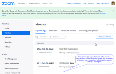
Immediately after I log in, this is the page I get. Nothing about my scheduled meetings. Nothing to prompt me to create a new one. I don't want to host a meeting or join a meeting. I want to see what I've got coming up.
So I go to "My Account" (top right), even though that's usually where I put things relating to contact info and payment. Oh well, it gets me closer. I can see a list of meetings by clicking on the left.
Even so, the aim seems to be on managing meetings. It would be nice to have links right up front to cut/paste into emails and messaging services.
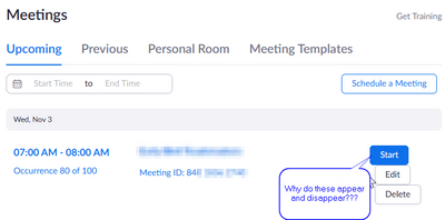
The "now you see them, now you don't" buttons are an additional aggravation. Why aren't these just links next to each meeting in the list, rather than something that shows up or not based on where my pointer is?
- Mark as New
- Bookmark
- Subscribe
- Mute
- Subscribe to RSS Feed
- Permalink
- Report Inappropriate Content
2021-11-02 04:15 AM
Hi @GeekPriest
The hover-over button in the Meeting list can take a little getting used to.
But the other problems you've described are not consistent with my experience. What links are you using to get to the pages you want?
For example: Meetings: https://zoom.us/meeting
You may like to also submit your feedback at: https://zoom.us/feed
- Mark as New
- Bookmark
- Subscribe
- Mute
- Subscribe to RSS Feed
- Permalink
- Report Inappropriate Content
2023-02-28 01:55 PM
you are right i cant belive no one liked it wait im no one im mean no other people but i did like it
- Mark as New
- Bookmark
- Subscribe
- Mute
- Subscribe to RSS Feed
- Permalink
- Report Inappropriate Content
2023-02-28 01:55 PM
naaaaaaaaaaaa
- Zoom backgrounds in Zoom Contact Center
- Feature Request: In-App Confirmation Capture in Zoom Phone System
- Bypass the login screen with registered users and private mettings in Zoom Meetings
- Seeking Guidance on Integrating Zoom with My Website in Zoom Workspace Reservation
- Custom Branding Issue: Cannot Hide Header and Footer - Custom CSS Option Missing in Zoom Webinars


