The Zoom website is dumb
I'm posting this because I use Zoom for two organizations I work with. I know Zoom's focus is likely on the relevant factors relating to the virtual conferences themselves, but I'd like to suggest some needed improvements to the website itself.
Immediately after I log in, this is the page I get. Nothing about my scheduled meetings. Nothing to prompt me to create a new one. I don't want to host a meeting or join a meeting. I want to see what I've got coming up.
So I go to "My Account" (top right), even though that's usually where I put things relating to contact info and payment. Oh well, it gets me closer. I can see a list of meetings by clicking on the left.
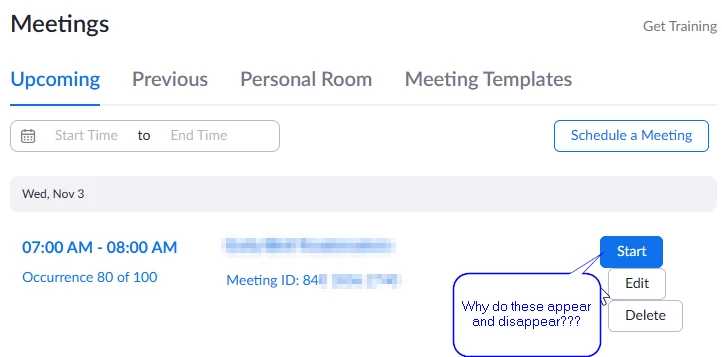
Even so, the aim seems to be on managing meetings. It would be nice to have links right up front to cut/paste into emails and messaging services.
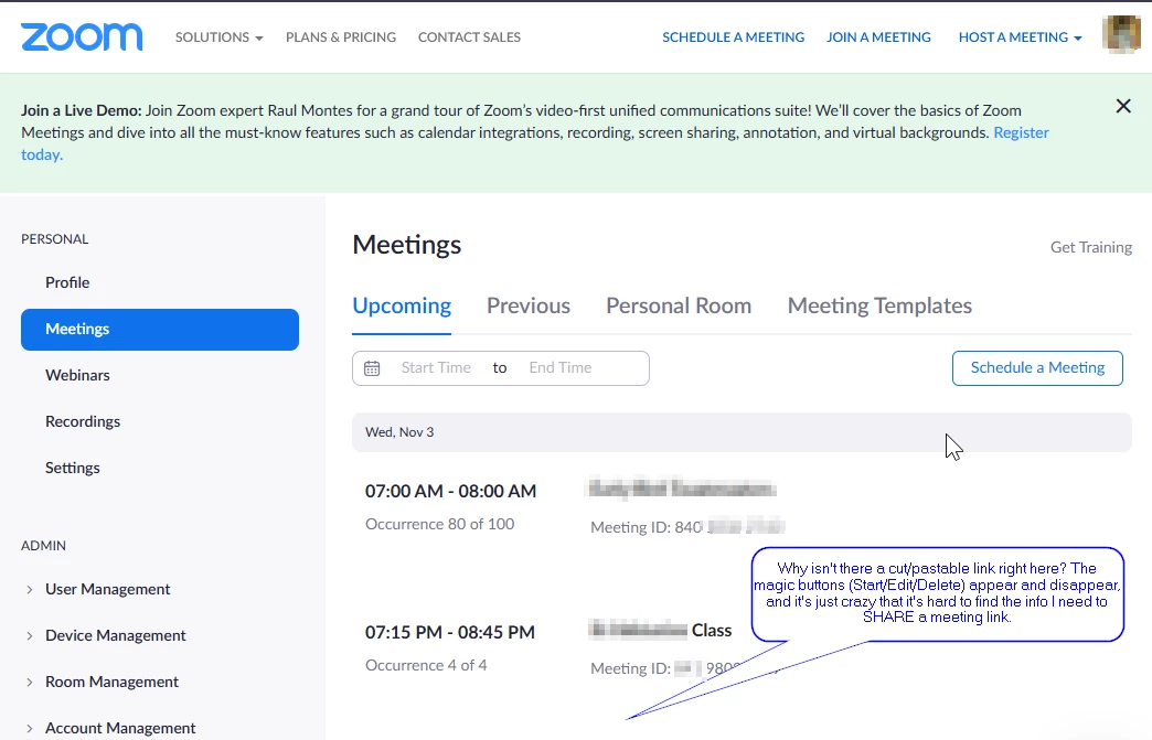
The "now you see them, now you don't" buttons are an additional aggravation. Why aren't these just links next to each meeting in the list, rather than something that shows up or not based on where my pointer is?