
Question
Navigating Host Tools Took a Big Step Backward
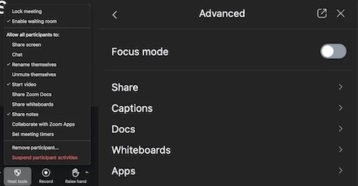
The interface on the right is not an improvement over that on the left. Seriously, why? I’m now clicking 25% more to get to my same configuration for my meetings. I’m not opposed to putting the controls in the sidebar, but drilling down multiple levels is a serious regression in usability.