Zoomtopia is here. Unlock the transformative power of generative AI, helping you connect, collaborate, and Work Happy with AI Companion.
Register nowEmpowering you to increase productivity, improve team effectiveness, and enhance skills.
Learn moreKeep your Zoom app up to date to access the latest features.
Download Center Download the Zoom appDownload hi-res images and animations to elevate your next Zoom meeting.
Browse Backgrounds Zoom Virtual BackgroundsEmpowering you to increase productivity, improve team effectiveness, and enhance skills.
Zoom AI CompanionUser groups are unique spaces where community members can collaborate, network, and exchange knowledge on similar interests and expertise.
Help & Resources is your place to discover helpful Zoom support resources, browse Zoom Community how-to documentation, and stay updated on community announcements.
The Events page is your destination for upcoming webinars, platform training sessions, targeted user events, and more. Stay updated on opportunities to enhance your skills and connect with fellow Zoom users.
Starting February 3, 2025, Zoom Phone customers must add their phone numbers to an approved 10DLC campaign in order to use SMS/MMS capabilities on their numbers.
Introducing more live support options! More Zoom customers now have access to live agent chat support. Sign in and visit our Contact Support page to see all your available support options. We’re here to help!
2024-04-30 08:58 AM
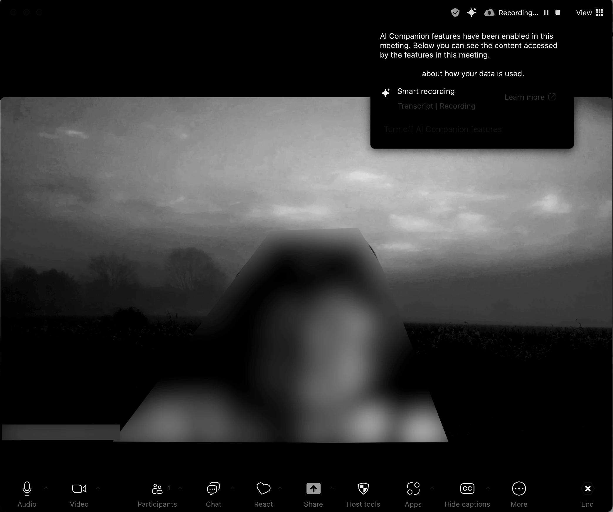
I took a screenshot of the new design (Zoom Workplace Version: 6.0.2 (33403) - working on a Mac with OS 14.4] and then put it in grayscale which helps find issues that might affect users with visual disabilities like color blindness and/or low vision.
There are a few WCAG issues:
- red on black is almost always problematic for those with the most common color blindness
- the text of the icons is really hard to see and do not meet minimum contrast requirements
- there is a link in blue text that is nearly impossible to discern and does not meet minimum contrast requirements
- the links in red text are very difficult to discern in gray scale
- the sharp line drawings of icons may be hard for those with low vision to see
Please take these issues into consideration and correct them. They are negatively affecting a number of our employees/users.
2024-05-02 07:07 AM
Wanted to include a screen shot of screen as a participant as well